
Why the Best Shopify Stores Are Reducing Choices Instead of Adding More Features
Why the Best Shopify Stores Are Reducing Choices Instead of Adding More Features

Article by
Milo
ESL Content Coordinator & Educator
ESL Content Coordinator & Educator
All Posts
There is a curious point that many people notice when shopping online. Sometimes the site looks so modern that it is impossible to use it. Pop-up windows, an offer to subscribe, a discount timer, recommendations, a support chat, a block with reviews, a dozen filters, and several more buttons appear on the screen at the same time, the purpose of which does not immediately become clear. Instead of wanting to buy, there is a completely different feeling – you want to close the tab.
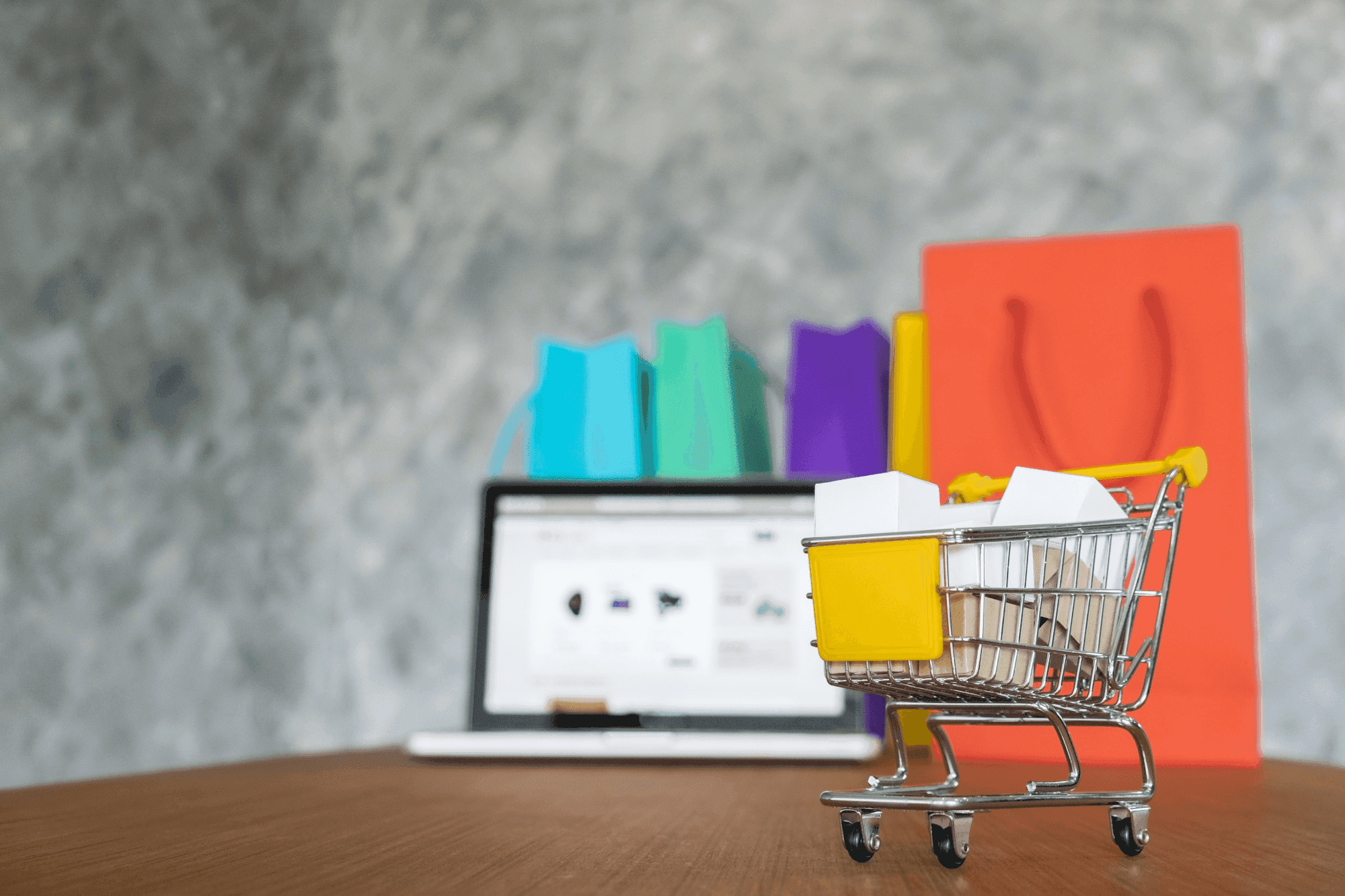
The most interesting thing is that the best Shopify stores are increasingly going in the opposite direction. They don't try to impress with the number of features. On the contrary, they consistently remove everything that distracts from the main thing – the product itself and the purchase process.
Still grading everything by hand?
EMStudio is a free teaching management app — manage your classes, students, lessons, and more!
Learn More
Still grading everything by hand?
EMStudio is a free teaching management app — manage your classes, students, lessons, and more!
Learn More
Table of Contents
The price of unnecessary choice
It seems logical that a large selection helps everyone find the right option. In practice, everything works more complicated. Each additional decision requires attention. What size to choose? Do you need this filter? Should you open another tab with a similar product? Even a few extra seconds gradually turn into fatigue.
“The more choices we have, the less satisfied we are with the choice we make.” – Barry Schwartz, psychologist and author of The Paradox of Choice.
That is why store owners are increasingly turning not only to designers, but also to specialists in artificial intelligence and machine learning development to understand which elements really help the user, and which ones exist only because "everyone does it that way." Analysis of customer behavior increasingly leads to an unexpected conclusion: unnecessary functions are used much less often than it seems.
The customer rarely notices a successful interface. But it feels great when the site starts demanding too much attention.
Why does simplicity look more expensive?
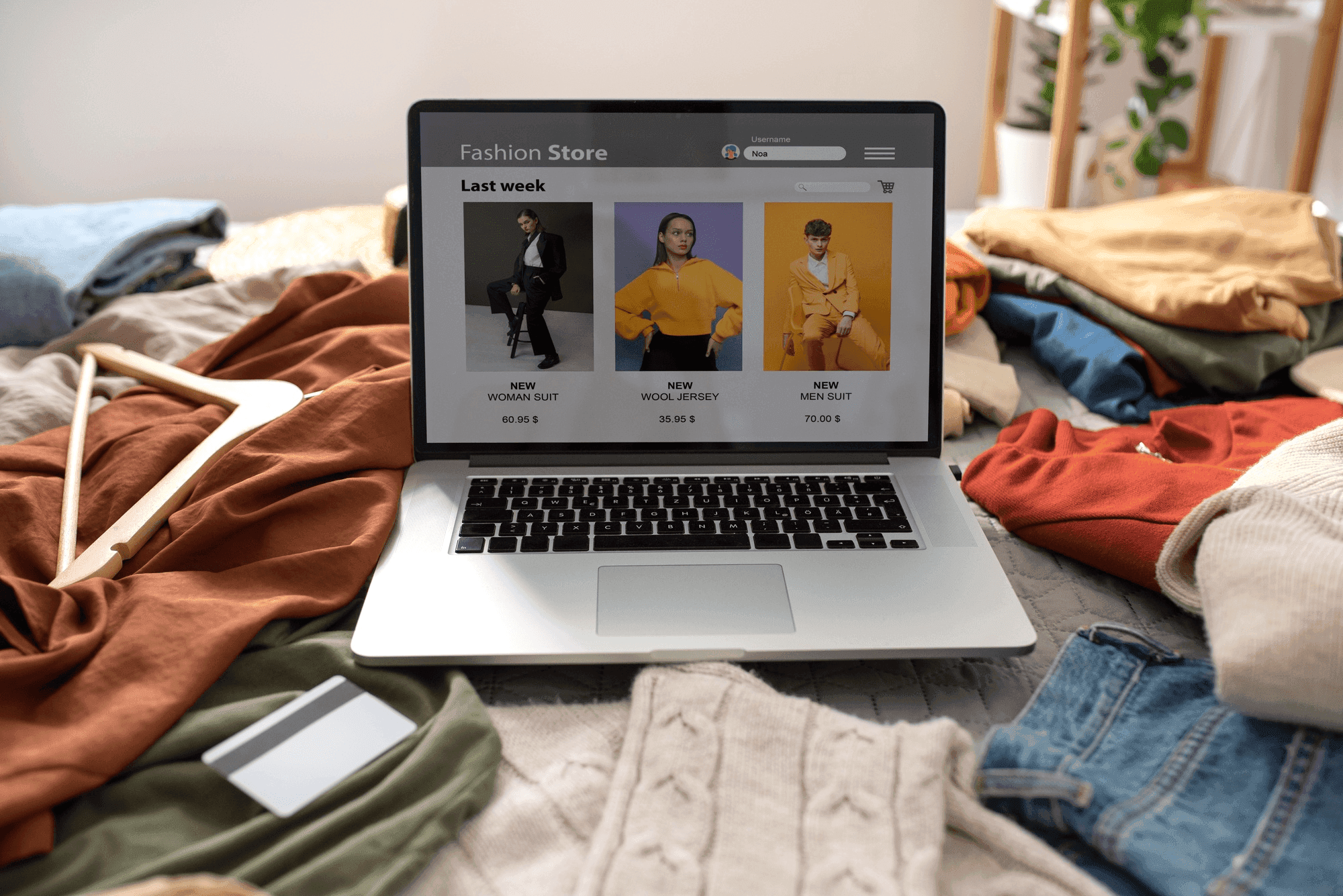
There is a reason why the websites of well-known premium brands rarely look overloaded. They don't try to show absolutely everything at once. The space around the product works almost as efficiently as the product itself.
If everything is removed from the page except the necessary information, it's much easier for a person to focus. They focus on the product description, details, and images – not the close button of an additional banner.
[b]
Minimalism does not mean poor functionality. Rather, the opposite. To remove unnecessary items, you have to understand customer behavior much better. A simple page almost always requires more work than a complex one. After all, you can delete a lot, but you need to leave exactly what you need, without which the purchase will really become more difficult.
What features really help you sell
Over the past few years, top Shopify stores have slowly started to find solutions in the same manner. They use tools that enable them to make decisions more quickly rather than dozens of apps.
It usually looks like this:
clear navigation;
quick search;
high-quality product photos;
transparent delivery and return terms;
the simplest possible checkout process.
The common idea behind all these choices is simple: every element should answer a question or remove hesitation. If a feature doesn't help the customer move forward, it usually creates another reason to leave the page instead. Each of these elements removes questions instead of creating new ones. That's why they work better than the many spectacular add-ons that online stores love to overload.
What's interesting is that many functions that seemed essential a couple of years ago are slowly going out of the picture these days. Large carousels on the homepage, elaborate animations, flurry of pop-up promotions, and jammed sidebars are giving way to a serene, user-friendly experience.
Speed is also becoming part of the design
An excessive number of apps affects more than just the appearance of the store. It literally makes the site heavier.
Each additional module means new requests, additional scripts, and a few more seconds of waiting. It seems that the difference is almost imperceptible. But the visitor perceives it differently. While the page is loading, attention is already switching to another tab.
Therefore, experienced Shopify store owners regularly carry out a kind of general cleaning. They are not looking for another extension, but are asking themselves another question: what can be removed without prejudice to the buyer?
Sometimes it is after such an audit that the site starts working faster, and the conversion rate unexpectedly increases without increasing the advertising budget.
A design that requires no explanation
The best online stores are almost invisible. It sounds weird, but that's exactly how a good interface works. A person doesn't think about the location of buttons, menu logic, or the number of filters. Everything happens so naturally that attention is completely shifted to the product.
When the design stops fighting for attention, it becomes easier for the buyer to make decisions. They feel confident, although are unlikely to be able to explain where it came from.
This is the difference between a mature project and a store that is trying to impress with the number of possibilities. The first one helps. The second one constantly demonstrates its own functions.
Sometimes the best feature is the one that doesn't exist
Online stores have long competed with each other on the number of tools and features. Today, more and more successful projects compete in another way – how easily a person can make a purchase.
It requires discipline. Adding a new feature is always easier than discarding an existing one. But it is the ability to remove excess that is gradually becoming a competitive advantage.
Ultimately, a good store is remembered not by the number of buttons, but by the feeling that everything turned out to be surprisingly simple. And perhaps it is this simplicity that is becoming the most expensive element of the digital experience today.
FAQ
1. Does simplifying my Shopify store really increase sales?
Yes, in most cases. When you remove distractions and make the buying process easier, more visitors complete their purchase.
2. Should I delete all apps and extra features?
Not all. Keep only the ones that clearly help customers or solve real problems. Everything else is worth testing for removal.
3. How do I decide what to remove from my store?
Look at your analytics. If something is rarely used, slows down the site, or distracts people from the product — it's usually safe to remove.
4. Is this minimalist approach suitable for every Shopify store?
It works great for most stores, especially fashion, beauty, home goods, and premium brands. Even if you sell complex products, cleaner design almost always helps.
Emma Laurent is a UX designer and Shopify e-commerce specialist. She helps brands simplify their stores, remove clutter, and boost conversions through clean, customer-focused design.

The price of unnecessary choice
It seems logical that a large selection helps everyone find the right option. In practice, everything works more complicated. Each additional decision requires attention. What size to choose? Do you need this filter? Should you open another tab with a similar product? Even a few extra seconds gradually turn into fatigue.
“The more choices we have, the less satisfied we are with the choice we make.” – Barry Schwartz, psychologist and author of The Paradox of Choice.
That is why store owners are increasingly turning not only to designers, but also to specialists in artificial intelligence and machine learning development to understand which elements really help the user, and which ones exist only because "everyone does it that way." Analysis of customer behavior increasingly leads to an unexpected conclusion: unnecessary functions are used much less often than it seems.
The customer rarely notices a successful interface. But it feels great when the site starts demanding too much attention.
Why does simplicity look more expensive?
There is a reason why the websites of well-known premium brands rarely look overloaded. They don't try to show absolutely everything at once. The space around the product works almost as efficiently as the product itself.
If everything is removed from the page except the necessary information, it's much easier for a person to focus. They focus on the product description, details, and images – not the close button of an additional banner.
[b]
Minimalism does not mean poor functionality. Rather, the opposite. To remove unnecessary items, you have to understand customer behavior much better. A simple page almost always requires more work than a complex one. After all, you can delete a lot, but you need to leave exactly what you need, without which the purchase will really become more difficult.
What features really help you sell
Over the past few years, top Shopify stores have slowly started to find solutions in the same manner. They use tools that enable them to make decisions more quickly rather than dozens of apps.
It usually looks like this:
clear navigation;
quick search;
high-quality product photos;
transparent delivery and return terms;
the simplest possible checkout process.
The common idea behind all these choices is simple: every element should answer a question or remove hesitation. If a feature doesn't help the customer move forward, it usually creates another reason to leave the page instead. Each of these elements removes questions instead of creating new ones. That's why they work better than the many spectacular add-ons that online stores love to overload.
What's interesting is that many functions that seemed essential a couple of years ago are slowly going out of the picture these days. Large carousels on the homepage, elaborate animations, flurry of pop-up promotions, and jammed sidebars are giving way to a serene, user-friendly experience.
Speed is also becoming part of the design
An excessive number of apps affects more than just the appearance of the store. It literally makes the site heavier.
Each additional module means new requests, additional scripts, and a few more seconds of waiting. It seems that the difference is almost imperceptible. But the visitor perceives it differently. While the page is loading, attention is already switching to another tab.
Therefore, experienced Shopify store owners regularly carry out a kind of general cleaning. They are not looking for another extension, but are asking themselves another question: what can be removed without prejudice to the buyer?
Sometimes it is after such an audit that the site starts working faster, and the conversion rate unexpectedly increases without increasing the advertising budget.
A design that requires no explanation
The best online stores are almost invisible. It sounds weird, but that's exactly how a good interface works. A person doesn't think about the location of buttons, menu logic, or the number of filters. Everything happens so naturally that attention is completely shifted to the product.
When the design stops fighting for attention, it becomes easier for the buyer to make decisions. They feel confident, although are unlikely to be able to explain where it came from.
This is the difference between a mature project and a store that is trying to impress with the number of possibilities. The first one helps. The second one constantly demonstrates its own functions.
Sometimes the best feature is the one that doesn't exist
Online stores have long competed with each other on the number of tools and features. Today, more and more successful projects compete in another way – how easily a person can make a purchase.
It requires discipline. Adding a new feature is always easier than discarding an existing one. But it is the ability to remove excess that is gradually becoming a competitive advantage.
Ultimately, a good store is remembered not by the number of buttons, but by the feeling that everything turned out to be surprisingly simple. And perhaps it is this simplicity that is becoming the most expensive element of the digital experience today.
FAQ
1. Does simplifying my Shopify store really increase sales?
Yes, in most cases. When you remove distractions and make the buying process easier, more visitors complete their purchase.
2. Should I delete all apps and extra features?
Not all. Keep only the ones that clearly help customers or solve real problems. Everything else is worth testing for removal.
3. How do I decide what to remove from my store?
Look at your analytics. If something is rarely used, slows down the site, or distracts people from the product — it's usually safe to remove.
4. Is this minimalist approach suitable for every Shopify store?
It works great for most stores, especially fashion, beauty, home goods, and premium brands. Even if you sell complex products, cleaner design almost always helps.
Emma Laurent is a UX designer and Shopify e-commerce specialist. She helps brands simplify their stores, remove clutter, and boost conversions through clean, customer-focused design.
Still grading everything by hand?
EMStudio is a free teaching management app — manage your classes, students, lessons, and more!
Learn More
Still grading everything by hand?
EMStudio is a free teaching management app — manage your classes, students, lessons, and more!
Learn More




Notion4Teachers
Notion templates to simplify administrative tasks and enhance your teaching experience.



2026 Notion4Teachers. All Rights Reserved.
Notion4Teachers
Notion templates to simplify administrative tasks and enhance your teaching experience.
2026 Notion4Teachers. All Rights Reserved.
Notion4Teachers
Notion templates to simplify administrative tasks and enhance your teaching experience.
2026 Notion4Teachers. All Rights Reserved.