Generate Logo Variations for Different Educational Digital Platforms
Generate Logo Variations for Different Educational Digital Platforms

Article by
Milo
ESL Content Coordinator & Educator
ESL Content Coordinator & Educator
All Posts
That brilliant logo that appears terrific on a school website banner may become a fuzzy, cropped icon when it's on a small app.That great logo that looks terrific on the school banner for the website can look like a fuzzy little cropped icon for an app. Eventually, most schools, tutoring companies, and classroom brands find themselves at the same point: they have one branding but ten different rules of size and shape to follow.
To save on having to redesign everything again when a new learning platform appears, more teachers are using an AI image generation tool to make some tweaks to the original design while keeping it the same. Dreamina is a popular choice for educators and learners because of the advanced image generation options that make it easy to produce an entire logo suite, which used to be quite painful.
Still grading everything by hand?
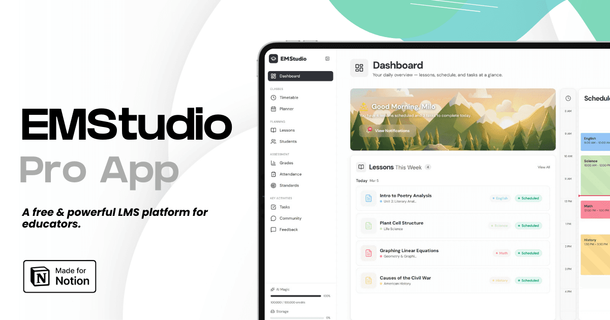
EMStudio is a free teaching management app — manage your classes, students, lessons, and more!
Learn More
Still grading everything by hand?
EMStudio is a free teaching management app — manage your classes, students, lessons, and more!
Learn More
Table of Contents
Why one logo file is never actually enough
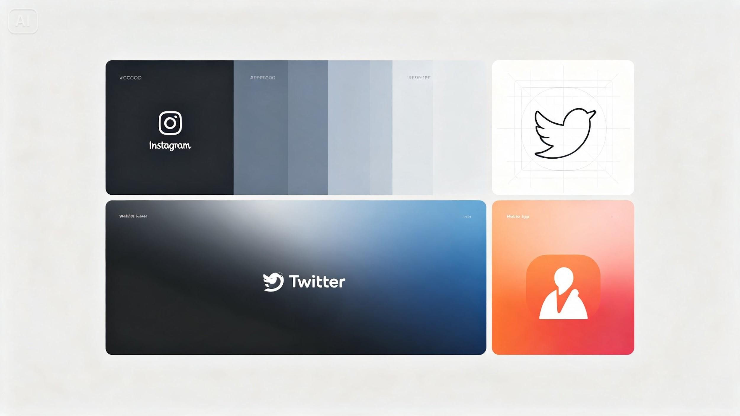
The shape and distance of view of a Google Classroom header, a favicon, a newsletter letterhead, and a banner at the school entrance are very different. A design that looks great on a poster hanging on the hallway at 32 x 32 might be completely lost at larger size. Variation from the outset of the project can be avoided as it is not necessary to climb down to resize as per the requirements of the new platform's spec.
Educational platforms that quietly need their own version
Some formats are obvious; others get forgotten until the first day of term:
Square app icons and profile pictures for your LMS or class app
Wide horizontal banners for school websites and parent email headers
Circular badges for social avatars and online course pages
Simplified single-color marks for worksheet watermarks, certificates, or stamps
Tall vertical formats for stories, event announcements, and mobile ads
Simplifying a mark without losing its identity
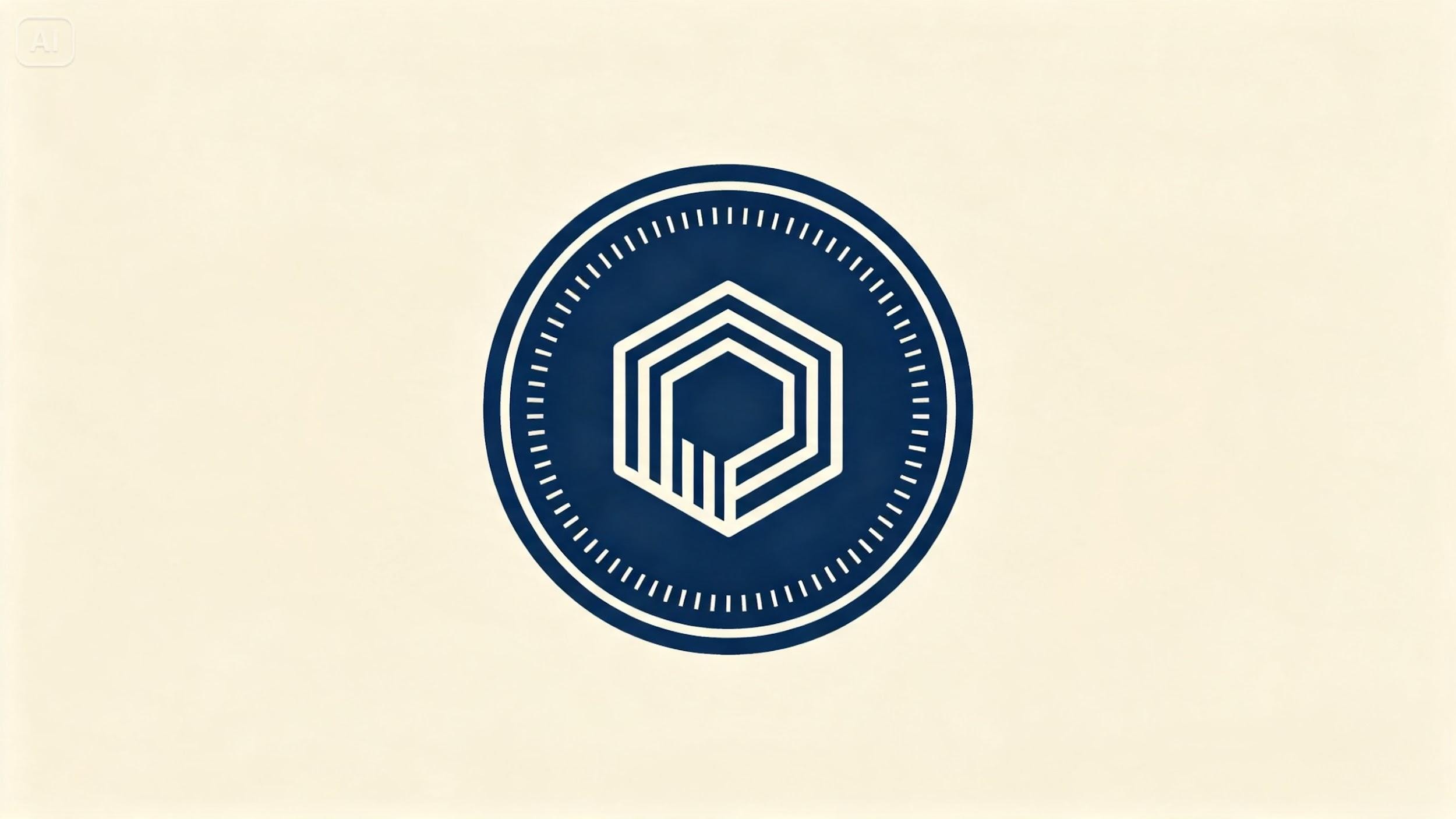
The most significant danger of making variations is to deviate from the original design until it does not appear to be the same school or program. The solution is to agree to the non-negotiables as early as possible, and then make all the rest negotiable (in this case, shape, exact color codes, and typography, if there is any). It's still obvious to anyone who looks at it that it's the same brand at a quick glance, even if there is a circular badge on a student portal, or a horizontal wordmark on a newsletter.
Color considerations across light and dark interfaces
Most learning platforms today support both light and dark modes, and a logo that only works on white backgrounds will disappear on a dark navigation bar. When generating variations, plan for:
A full-color version for standard use
A reversed or light version for dark backgrounds
A single-color or monochrome version for stamps, certificates, and watermarks
Dreamina's model lineup for design-heavy teacher work
Seedream 5.0 Pro
Seedream 5.0 Pro is Dreamina's latest and most powerful version, and is particularly effective for logo and icon design, as well as for any task that demands crisp lines, precise shapes, and sharp colors. It is the one that's best to pursue first when consistency of a whole logo family matters.
Nano Banana
Nano Banana's version, on the other hand, is a slightly softer and more illustrative version — a fun choice for early-years classrooms or programs looking for something to create a hand-drawn style as opposed to a hard-mark institutional look.
GPT Image 2
GPT Image 2 rounds out the lineup as another strong option for exploring alternate takes on the same concept, useful when you want to compare a few directions (or let students vote on them) before settling on a final logo family.
How you can generate a logo family with Dreamina
Step 1: Write a text prompt
Open Dreamina and talk about your logo idea, including the icon, the shape your icon will be placed in, the colors you will use and the overall style. A concise emblem logo for a children's reading program is appropriate: A single open book icon inside a circular badge, navy and warm yellow color scheme, simple linework in a vector style, flat background.
If you already have an existing school or class logo you want to riff on, upload it as a reference image so new variations stay visually tied to it.
Step 2: Adjust parameters and generate
Set the model to Image 5.0 Pro by Seedream 5.0 Pro, since its precision with clean shapes and linework makes it especially strong for logo work. Choose a square aspect ratio for icon-style variations or a wide ratio for banner versions, then select 1K for quick concepting or 2K when you need a crisp file for printed handouts, certificates, or large digital displays. Tap the generate icon once everything is set.
Step 3: Customize and download
Use Dreamina's editing tools to push each variation closer to platform-ready. Inpaint to adjust small details like icon spacing, expand the canvas if a banner version needs more horizontal room, remove any unwanted background elements, and retouch edges so linework stays crisp. When each version looks right, click download to save it to your logo suite.
Building a simple usage guide alongside your files
Generating variations and then having to explain to other colleagues, TAs or others who are responsible for the social media and communication with parents saves a lot of time in guessing.
Avoiding the most common logo variation mistakes
When using detailed logo in a small space that isn't large enough to read.
Allowing for some color variation between releases
The memory loss of a dark-background variant when there is a need for it urgently!
Ditching a simplified version of icons altogether
Organizing files so the right version gets used
A logo suite is only useful if the correct file gets grabbed at the right moment, whether by you, a colleague, or a parent volunteer. A simple folder structure prevents a lot of headaches:
One folder per format type (icon, banner, watermark)
File names that state the background it's meant for, like "logo-dark-bg" or "logo-light-bg"
A single "current" folder that's replaced entirely whenever the brand updates, so old versions never get mixed in
Knowing when a variation needs a refresh
Sometimes learning platforms adjust the size or the shape of the icons, safe zones, or the display size, and an old logo variant can subtly look like it's a little bit out of place. It's a good idea to review your logo suite a couple of times during the school year, so you can catch these minor discrepancies before they become the icons of your logo that get chopped off or placed in an awkward spot when they go live.
It's not a logo suite that aims to rebrand your school for various new platforms.It is not a logo suite to rebrand your school for various new platforms. It's about producing just the right amount of loyal, just the right kinds of variations off of one great foundation. Using clear reference prompts and the generation and refinement of the educator's ideas made by the Dreamina, an educator can move from a single logo file to a complete, ready-to-use set on a platform in an afternoon.
Why one logo file is never actually enough
The shape and distance of view of a Google Classroom header, a favicon, a newsletter letterhead, and a banner at the school entrance are very different. A design that looks great on a poster hanging on the hallway at 32 x 32 might be completely lost at larger size. Variation from the outset of the project can be avoided as it is not necessary to climb down to resize as per the requirements of the new platform's spec.
Educational platforms that quietly need their own version
Some formats are obvious; others get forgotten until the first day of term:
Square app icons and profile pictures for your LMS or class app
Wide horizontal banners for school websites and parent email headers
Circular badges for social avatars and online course pages
Simplified single-color marks for worksheet watermarks, certificates, or stamps
Tall vertical formats for stories, event announcements, and mobile ads
Simplifying a mark without losing its identity
The most significant danger of making variations is to deviate from the original design until it does not appear to be the same school or program. The solution is to agree to the non-negotiables as early as possible, and then make all the rest negotiable (in this case, shape, exact color codes, and typography, if there is any). It's still obvious to anyone who looks at it that it's the same brand at a quick glance, even if there is a circular badge on a student portal, or a horizontal wordmark on a newsletter.
Color considerations across light and dark interfaces
Most learning platforms today support both light and dark modes, and a logo that only works on white backgrounds will disappear on a dark navigation bar. When generating variations, plan for:
A full-color version for standard use
A reversed or light version for dark backgrounds
A single-color or monochrome version for stamps, certificates, and watermarks
Dreamina's model lineup for design-heavy teacher work
Seedream 5.0 Pro
Seedream 5.0 Pro is Dreamina's latest and most powerful version, and is particularly effective for logo and icon design, as well as for any task that demands crisp lines, precise shapes, and sharp colors. It is the one that's best to pursue first when consistency of a whole logo family matters.
Nano Banana
Nano Banana's version, on the other hand, is a slightly softer and more illustrative version — a fun choice for early-years classrooms or programs looking for something to create a hand-drawn style as opposed to a hard-mark institutional look.
GPT Image 2
GPT Image 2 rounds out the lineup as another strong option for exploring alternate takes on the same concept, useful when you want to compare a few directions (or let students vote on them) before settling on a final logo family.
How you can generate a logo family with Dreamina
Step 1: Write a text prompt
Open Dreamina and talk about your logo idea, including the icon, the shape your icon will be placed in, the colors you will use and the overall style. A concise emblem logo for a children's reading program is appropriate: A single open book icon inside a circular badge, navy and warm yellow color scheme, simple linework in a vector style, flat background.
If you already have an existing school or class logo you want to riff on, upload it as a reference image so new variations stay visually tied to it.
Step 2: Adjust parameters and generate
Set the model to Image 5.0 Pro by Seedream 5.0 Pro, since its precision with clean shapes and linework makes it especially strong for logo work. Choose a square aspect ratio for icon-style variations or a wide ratio for banner versions, then select 1K for quick concepting or 2K when you need a crisp file for printed handouts, certificates, or large digital displays. Tap the generate icon once everything is set.
Step 3: Customize and download
Use Dreamina's editing tools to push each variation closer to platform-ready. Inpaint to adjust small details like icon spacing, expand the canvas if a banner version needs more horizontal room, remove any unwanted background elements, and retouch edges so linework stays crisp. When each version looks right, click download to save it to your logo suite.
Building a simple usage guide alongside your files
Generating variations and then having to explain to other colleagues, TAs or others who are responsible for the social media and communication with parents saves a lot of time in guessing.
Avoiding the most common logo variation mistakes
When using detailed logo in a small space that isn't large enough to read.
Allowing for some color variation between releases
The memory loss of a dark-background variant when there is a need for it urgently!
Ditching a simplified version of icons altogether
Organizing files so the right version gets used
A logo suite is only useful if the correct file gets grabbed at the right moment, whether by you, a colleague, or a parent volunteer. A simple folder structure prevents a lot of headaches:
One folder per format type (icon, banner, watermark)
File names that state the background it's meant for, like "logo-dark-bg" or "logo-light-bg"
A single "current" folder that's replaced entirely whenever the brand updates, so old versions never get mixed in
Knowing when a variation needs a refresh
Sometimes learning platforms adjust the size or the shape of the icons, safe zones, or the display size, and an old logo variant can subtly look like it's a little bit out of place. It's a good idea to review your logo suite a couple of times during the school year, so you can catch these minor discrepancies before they become the icons of your logo that get chopped off or placed in an awkward spot when they go live.
It's not a logo suite that aims to rebrand your school for various new platforms.It is not a logo suite to rebrand your school for various new platforms. It's about producing just the right amount of loyal, just the right kinds of variations off of one great foundation. Using clear reference prompts and the generation and refinement of the educator's ideas made by the Dreamina, an educator can move from a single logo file to a complete, ready-to-use set on a platform in an afternoon.
Still grading everything by hand?
EMStudio is a free teaching management app — manage your classes, students, lessons, and more!
Learn More
Still grading everything by hand?
EMStudio is a free teaching management app — manage your classes, students, lessons, and more!
Learn More


Notion4Teachers
Notion templates to simplify administrative tasks and enhance your teaching experience.



2026 Notion4Teachers. All Rights Reserved.
Notion4Teachers
Notion templates to simplify administrative tasks and enhance your teaching experience.
2026 Notion4Teachers. All Rights Reserved.
Notion4Teachers
Notion templates to simplify administrative tasks and enhance your teaching experience.
2026 Notion4Teachers. All Rights Reserved.